Tuesday, 30 April 2013

Week 11 - Cameras and Lighting

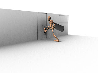
Now that all of the characters are in a scene and are animating properly, we have had to start looking into different lighting methods. The way we decided to do this was through creating directional lighting and spot lights. This created a nice ambient effect and we adjusted the colour balance of the lights to ad a tint of orange to the room.

Lighting


As you can see in the above image, we have a directional light which is providing the overall global illumination, and we also have some spot lights dotted around on the ceiling to make it look like real lights.

The spot lights provide three quarter and rim lighting effects so it makes the characters pop out a bit more in the animation . Overall I feel that the scene looks very effective and the lighting makes all a difference. It is very cheap, efficient and easy to render too.
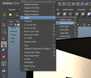
So how did we create the lighting? Making a directional light is easy. All you need to do is go to Create  > Lights > Directional light, or you can choose a spot light but for now we will focus on directional.

When the directional light has been created, you can click on the attribute editor and simple adjust the intensity, this is pretty much the only option we needed to adjust as it gave us the desired effect we wanted.
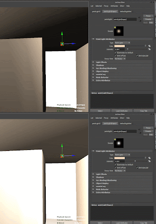
Other than that, there isn't much else you can do with a directional light, they are very limited in terms of variety and flexibility. Also it doesn't matter where the directional light is positioned in the scene because no matter where you put it, it will always have the same lighting effect. It works based on the rotation. So if it was facing down, it would be identical to having the sun at its highest peak in the mid day.

For the spot light, its a similar process, just click the light and change the colour, as you can see I've changed it to a orange hue.

When you have done this simply change the intensity, as you can see in the image, its affecting the brightness.

That concludes the lighting we used for our scene, very simple but very effective in the long run and it made our cinematic look brilliant by the end.

Camera Angles

When we animated our scenes, we decided we wanted to animate the cameras old school and physically move the cameras and key each individual frame to try and achieve a smooth fluent camera sweep motion.


Above is an example of the kind of camera movements I was trying to create from scene 1, we did this manually, so we didn't need to attach the camera to a CV curve and allocate a path for it to follow, We did it key frame by key frame. 


Above you can see an image which shows the camera trail i have animated for that exact video, as you can see on the time slider, the camera has been key framed and repositioned each frame to add a basic but realistic camera pan. I see this as being classed as "Cinéma Vérité", This means that the animation is created in the style of a director filming using hand held cameras instead of rigging them up or having them set up on a tripod.

To create a camera its simple, just go to Create > Cameras > Create Camera, there are different cameras such as Camera and Aim and Camera, Aim and Up. All of which have their different technicality's. But for the purpose of this post I am only talking about the camera that i used which was just the standard camera. I found this very useful. 
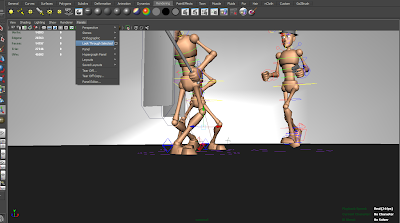
The cool thing about these cameras is that you can press "T" on the keyboard and select the focal point, so the camera will look at the target area you want it to, without changing the focal point, but still being able to adjust the position of the camera.

Another cool little trick is to select the camera, and hit Panel > Look Through Selected, this will allow you to look through the camera and see exactly what it is your aiming it.

Cameras are very easy to use, and the glory of them is that you can actually go into the cameras view, and move around like you would in perspective view, but you are actually positioning the camera to where you want it to be as you move around in its view.

Overall the camera angles we created weren't very technical but they really portrayed the animation well, and by over working the cameras, it can really throw the viewer off and it will distract from the animation itself. 

Monday, 22 April 2013

Week 10 - Importing All Characters

This week was literally just spent importing all of the characters into one Maya scene and trying to position the master nodes in the correct areas so the characters interact with the scene properly. The translation of the master controller was the only thing that needed editing at this point.


Above you can see the animation sequence for scene 6 where the detective is chasing the suspect out of the room as he jumps out the window. If you look carefully at the animation though, you can see that all i have done is animate the master node (large circle controller on the floor). 

Pay attention to the key frames, and you can see exactly how i have done this. Its so simple to do. You just move it, key it and move it again repeating the whole process. 

To actually import all of the characters into the scene is easy too, they will all start in the middle of the grid so a lot of positioning will be required. All you need to do to import each animation is click File > Import > (Select File). Its so simple to do and in no time we had our animations working fine. 

We did try to use the Trax editor but for some reason we had a lot of scripting issues and we decided not to bother, and we went the longer way around of doing it, but personally I think the animation turned out a lot better.

Tuesday, 16 April 2013

Week 9 - Making The Environment

Now that we have all of the animations, I decided I wanted to start making the environment and I did this using Maya. The way i did it was by building the environment around the characters themselves. As opposed to plotting the character into a scene I have positioned somewhere else.
Above is a render of a basic environment I have put together, It was quite simple and the walls are tiled, so they are made out of lots of individual panels so I can make a wall shorter or longer depending on the animation length and the span/distance at which a character runs.

I'm very happy with the environment and I think it went successfully as a test, but that Isn't quite what we were trying to achieve. Doing everything this way would have involved a hell of a lot of rendering time which we really didn't have time for, and applying the textures was very time consuming too. 


I am now going to talk about how to create an ambient occlusion texture which will make a white clinical look on your objects when you render out, exactly like the image above.

Its quite a simple process but it just takes a bit of practise. The first thing you need to do is open Hypershade. Click Window > Rendering Editors > Hypershade

First thing is we need to add a surface shader to the scene, to do this go into the hypershade and click "surface Shader", When you have done this proceed to the next step.


When the surface shader has been created, scroll down in the textures panel and search for "mib_amb_occlusion" and click it.

Next you need to link to two together and and the easiest way to do this is middle mouse drag the occlusion onto the surface shader then release, when options appear press default.

After you have connected the two you should have something that looks similar to this, now that they are both connected we need to apply them to the material mesh.

Select all of your geometry and right click the surface shader > assign material to all objects.

When you have done this the  geometry should now appear black. This is fine it just means that there is no light in the scene.


By default this is what a render should look like through mental ray, its not the best quality and its very grainy.

A way we can get around this is my changing the settings in mental ray. 
Make sure the following settings are set by following the image on the left. They are not the default settings but by following the image you will be able to sort out the grainy effect that we seem to keep getting.

The main settings which change this are the resolution, max samples, ambient occlusion shadows and setting the quality to production. 

When all of these settings have been changed your render should look something like the one below. 
Above you can see the final render, it looks far less grainy and the quality is excellent but this process of creating a nice scene is far too convoluted and takes a lot of time. It took me about 10 minutes to render one frame on the computers in university so time isn't something we can readily throw away and we had to find another means to render out our animations. 


Instead we applied some simple textures to the scene and this worked fine, it didn't have to deal with ambient occlusion rays and it wasn't difficult to calculate lighting . Overall, very happy with the result.

Saturday, 13 April 2013

Week 8 - Run Idle

This week I have been a little behind and have been catching up with some animation time, so i have fully completed my run cycle, Finding reference for this was very difficult because the way people run with riot shields is with their feet turned to the side.

Overall though I am extremely happy with the loop and I will show a batch render below of my animation so you get a good idea of what it looks like. But first I am going to demonstrate how the animation works as a block out, showing my silhouettes and reference. The reason I like showing the silhouetted out version is because you can get a sense of what is happening, and if you understand the movements, then that translates across to me as the character having a strong pose. By having a strong pose, you can create very effective animations that work well.


Above you can see a reference video (I look silly i know) of me impersonating a military soldier crossing his feet over as he walks with a riot shield. Seeming as i couldn't find any reference at all i decided to make my own. This proved useful when blocking out the pose as shown in the silhouette below. 
Above you can see an GIF of my walk cycle, it shows the basic block out frames that i made based off my reference video, I then focused on making everything perfect and securing a strong pose. It wasn't until after i had a very strong pose that i decided to start on creating the in-between frames. 


Finally the long awaited run cycle! This is the final render that I have created which portrays my character doing his run cycle, I am very happy with the end result and I cant wait to start compositing things into third party software packages now. If there is any more cleaning up to do with the animation I will do that at the end. Overall I'm very happy with the end result and quite proud of my animations. 

Thursday, 11 April 2013

Week 7 - Kick Door Animation

This week i have been working mainly on my animation, trying to get it perfect, I did work on it a bit over Easter but i didn't focus greatly on this module as i had quite a lot to do with my specialist 3D module.

Personally i have really enjoyed creating this animation i think its turned out brilliantly and i cant wait to composite it into some software with some descent camera angles plotted around it.


Above you can see video reference i got the girls to take of me, basically I'm very badly kicking down a door, that's what its supposed to look like anyway! I found using this reference very helpful for blocking out my animation itself, it allowed me get the extreme poses planned out without having to worry about in-between's.
Above you can see my blocked out render kicking down door animation, i found this very useful and as you can see, it relates quite well with my own reference video, i used that as a basis to create something that looked convincing. 

Now that i have the silhouetted version of my animation and the initial blocking out stage done, ill show you the final animation with all of the in-between's and it does look like a very convincing animation overall. 

Above you can see my final animation, I'm very happy with the way this has turned out, i am especially happy with the follow through and the landing. The idea of this animation is that the character kicks down the door, and just as its about to burst open, the camera angle changes to behind the door and you see it break open with the SWAT character landing as it swings open. 

Wednesday, 10 April 2013

Week 7 - Staging

Staging

Staging is a principle of animation used widely in animation and it is a very good technique to understand because it allows the animator to essentially become a director and portray their animations in the best possible way, there are many ways to do this and I will be discussing them throughout this post.

There are various ways to stage your scenes, the most common way is through the manipulation of camera angles and getting a good sense of depth of field. By doing this you are using a lot of artistic judgements and sensibility's to produce something enchanting and captivating. 

Thumb Nailing

This is a good technique  it allows you to get a visual idea as to how you would like your scene to look, and allows you to experiment with different attributes of your drawings, it can also spark inspiration and innovative ideas by putting pencil to paper or setting up your view port correctly. 

Animating the Camera

This is where you take all of your different ideas and thumbnails and you make a camera which you can animate on a curve, or by using key frames. This is excellent as it allows you to create fast dynamic movements, and it gives the illusion that the characters are moving but if your cleaver, it will be just the cameras doing the work. 

In film they use real cameras with cranes, helicopters and all different kinds of mechanical systems, the beauty of using software is that you can create artificial cameras which do the exact same thing, in the blink of an eye. 

Myself and my group were very cleaver with how we animated our scene, we decided that we would animate the props and environments around the characters, instead of the other way around. This was brilliant because it tricks the eye into believing that the characters are moving, and it makes life a lot simpler. These techniques combined with various camera angle can really create a nice punchy consistent cinematic. 

Audiences Attention

Grabbing the audiences attention is important, so framing everything perfectly comes hand in hand with this particular principle. If a character is executing a gesture and the camera is panned to the side and not cantered or zoomed right out, the audience will not register what is happening. 

In film they use shots called reaction shits, it is where a camera quickly zooms in and you get a close up of a persons reaction. This helps the viewer understand what is going on and depending on how the camera moves, and the sped of it, its also directing the audiences attention to a specific area in a scene. These methods are used a lot if many things are happening at once. 

Creating the Camera

Doing this couldn't be easier, there's a few controls involved, but simply go to Create > Cameras > Camera. This will create you a standard camera which will do everything for you. You can animate them by keying them, then repositioning the camera and setting another key frame, the camera will then animate between the two key frames. 

Tip: Its all about experimenting, another cool tip is to hit "T" on the keyboard, it allows you to choose where the cameras looking, so no matter how you move the camera, it will always have a target focal point. 

So overall staging is basically the process of setting up your cameras and becoming the director of your scene, when you get to more advanced levels you can practice with different effects such as lens flares and lens shattering, along with motion blurring and much more.