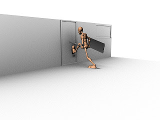
Thursday, 2 May 2013

Week 12 - Final Cinematic & Composition

Throughout this entire module we have been battling against time, and I feel like we have really achieved great animations as a group, and personally i am very happy with my own progression, i have learnt so much and i cant wait to start my third year.

Below you will find the FINAL cinematic that i have created myself, the group decided they all wanted to mix and match the scenes differently and try making it in their own style, so This is my version of the Cinematic with sound. Enjoy...


So the video is comprised of ten scenes, all of which have been seamlessly stitched together to try and create a very convincing animation. I think overall it looks really good, a lot more could have been added or edited, but I think that with the time we had and a group member leaving the university, it went great.

After Effects

So the way I made the entire video was through after effects, I was very sceptical about using this software at first because my knowledge of this software was and still is quite limited. But in a few hours of messing around, I started to work out exactly how layers work and I had some interesting stuff happening.


Above is a screen shot of my composition in after effects, it looks very complicated but actually it isn't, the most complex looking part is all of the layers.

The box on the middle left hand side is where you import all of your assets, its essentially a repository or a library. The bottom left box is the composition and layers box, This is where all of the magic happens.  In here i have text, sound files, and all of my scene clips (ten in total).

The bottom middle box is the time sliders and it shows the length of the animations themselves. The colour red is for text, Green is for animations or video files and dark green is for sound files.

I will take you through the process that I used to get to this stage starting from the beginning. Getting a batch render of about 200 JPEG files into After Effects and turn it into a AVI movie.


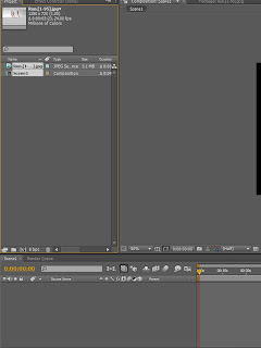
First of all, when you have a new project, the layout should be pretty dull and nothing is going on, the first thing that i needed to do was import the first frame of the animation sequence, by doing this i would be able to "interpret" the rest of the data, but ill talk about that in a minute. The best way to import in terms of speed and time efficiency, is to double click on the box with the green arrow pointing at it in the picture above. When the file browser opens, find the first frame of your animation.

IMPORTANT: Every animation file must be named in exactly the same conventional manor. My files are named as Name. #. Ext, this means that the name is followed by a number which is followed by the file format. 


When this is done the next thing we need to do is interpret the footage, this means that the rest of the frames will automatically link to the first frame, playing them all.

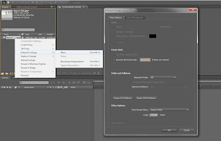
By now you should see the first frame in the library on the left, right click it and hit Interpret Footage > Main.
Make sure you change the frame rate to 24 frames per second because the animations have all been rendered in real time (24fps) now hit OK.

Now that the footage has been interpreted, if it has worked successfully you should be able to double left click on the file in the library and the whole animation should appear. 

You can scrub the time line bar which is located in the center and has all the seconds written on it. It should play through the whole animation.

Next we need to create a composition, the reason we do this is so that we can make a movie out of all of the key frames the software has interpreted.

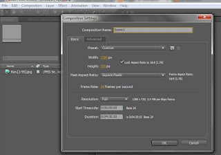
In the top menu bar click Composition > New, when a window appears make sure the following settings have been changed.

Composition Name - Scene 1
Preset - HDV/HDTV 720 25
Frames Per Second - 24
Duration - 4 minutes (length of the movie)

When the settings have been adjusted click OK.

Now on the left you can see that our composition has been made and is beneath the first sequence. Left click drag the sequence onto the composition, it should highlight.

You may also notice that the composition is in the bottom left panel which has now changed to a rendering panel.

Click on the composition on the left and navigate to the menu bar, clicking composition > make movie.


Now the bottom bar will have set the composition to be render-able as you can see in the image below.


Hit render and wait for it to finish, you will see the load bar processing as it renders out, and that covers how to render out each batch render you create using Maya starting form key frame one.


When the composition has rendered it will look something like this.


I hope this has helped anyone struggling to get to grips with after effects, and i hope this blog has encouraged others to experiment with their work flow as much as it encouraged me to throughout this huge learning curve. I can honestly say I am thrilled with the new knowledge i have learnt and am very excited to put it to the test over the summer. 

Tuesday, 30 April 2013

Week 11 - Cameras and Lighting

Now that all of the characters are in a scene and are animating properly, we have had to start looking into different lighting methods. The way we decided to do this was through creating directional lighting and spot lights. This created a nice ambient effect and we adjusted the colour balance of the lights to ad a tint of orange to the room.

Lighting


As you can see in the above image, we have a directional light which is providing the overall global illumination, and we also have some spot lights dotted around on the ceiling to make it look like real lights.

The spot lights provide three quarter and rim lighting effects so it makes the characters pop out a bit more in the animation . Overall I feel that the scene looks very effective and the lighting makes all a difference. It is very cheap, efficient and easy to render too.

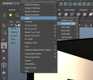
So how did we create the lighting? Making a directional light is easy. All you need to do is go to Create  > Lights > Directional light, or you can choose a spot light but for now we will focus on directional.

When the directional light has been created, you can click on the attribute editor and simple adjust the intensity, this is pretty much the only option we needed to adjust as it gave us the desired effect we wanted.

Other than that, there isn't much else you can do with a directional light, they are very limited in terms of variety and flexibility. Also it doesn't matter where the directional light is positioned in the scene because no matter where you put it, it will always have the same lighting effect. It works based on the rotation. So if it was facing down, it would be identical to having the sun at its highest peak in the mid day.

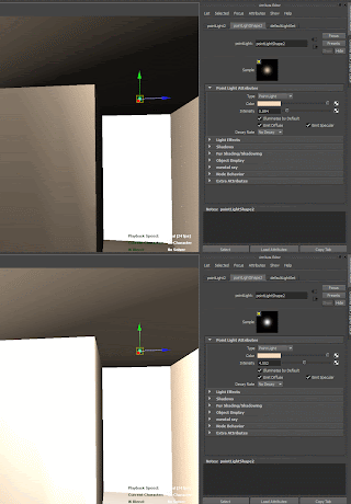
For the spot light, its a similar process, just click the light and change the colour, as you can see I've changed it to a orange hue.

When you have done this simply change the intensity, as you can see in the image, its affecting the brightness.

That concludes the lighting we used for our scene, very simple but very effective in the long run and it made our cinematic look brilliant by the end.

Camera Angles

When we animated our scenes, we decided we wanted to animate the cameras old school and physically move the cameras and key each individual frame to try and achieve a smooth fluent camera sweep motion.


Above is an example of the kind of camera movements I was trying to create from scene 1, we did this manually, so we didn't need to attach the camera to a CV curve and allocate a path for it to follow, We did it key frame by key frame. 


Above you can see an image which shows the camera trail i have animated for that exact video, as you can see on the time slider, the camera has been key framed and repositioned each frame to add a basic but realistic camera pan. I see this as being classed as "Cinéma Vérité", This means that the animation is created in the style of a director filming using hand held cameras instead of rigging them up or having them set up on a tripod.

To create a camera its simple, just go to Create > Cameras > Create Camera, there are different cameras such as Camera and Aim and Camera, Aim and Up. All of which have their different technicality's. But for the purpose of this post I am only talking about the camera that i used which was just the standard camera. I found this very useful. 

The cool thing about these cameras is that you can press "T" on the keyboard and select the focal point, so the camera will look at the target area you want it to, without changing the focal point, but still being able to adjust the position of the camera.

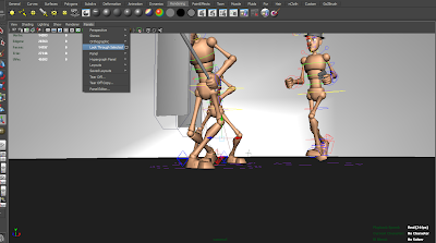
Another cool little trick is to select the camera, and hit Panel > Look Through Selected, this will allow you to look through the camera and see exactly what it is your aiming it.

Cameras are very easy to use, and the glory of them is that you can actually go into the cameras view, and move around like you would in perspective view, but you are actually positioning the camera to where you want it to be as you move around in its view.

Overall the camera angles we created weren't very technical but they really portrayed the animation well, and by over working the cameras, it can really throw the viewer off and it will distract from the animation itself. 

Monday, 22 April 2013

Week 10 - Importing All Characters

This week was literally just spent importing all of the characters into one Maya scene and trying to position the master nodes in the correct areas so the characters interact with the scene properly. The translation of the master controller was the only thing that needed editing at this point.


Above you can see the animation sequence for scene 6 where the detective is chasing the suspect out of the room as he jumps out the window. If you look carefully at the animation though, you can see that all i have done is animate the master node (large circle controller on the floor). 

Pay attention to the key frames, and you can see exactly how i have done this. Its so simple to do. You just move it, key it and move it again repeating the whole process. 

To actually import all of the characters into the scene is easy too, they will all start in the middle of the grid so a lot of positioning will be required. All you need to do to import each animation is click File > Import > (Select File). Its so simple to do and in no time we had our animations working fine. 

We did try to use the Trax editor but for some reason we had a lot of scripting issues and we decided not to bother, and we went the longer way around of doing it, but personally I think the animation turned out a lot better.

Tuesday, 16 April 2013

Week 9 - Making The Environment

Now that we have all of the animations, I decided I wanted to start making the environment and I did this using Maya. The way i did it was by building the environment around the characters themselves. As opposed to plotting the character into a scene I have positioned somewhere else.
Above is a render of a basic environment I have put together, It was quite simple and the walls are tiled, so they are made out of lots of individual panels so I can make a wall shorter or longer depending on the animation length and the span/distance at which a character runs.

I'm very happy with the environment and I think it went successfully as a test, but that Isn't quite what we were trying to achieve. Doing everything this way would have involved a hell of a lot of rendering time which we really didn't have time for, and applying the textures was very time consuming too. 


I am now going to talk about how to create an ambient occlusion texture which will make a white clinical look on your objects when you render out, exactly like the image above.

Its quite a simple process but it just takes a bit of practise. The first thing you need to do is open Hypershade. Click Window > Rendering Editors > Hypershade

First thing is we need to add a surface shader to the scene, to do this go into the hypershade and click "surface Shader", When you have done this proceed to the next step.


When the surface shader has been created, scroll down in the textures panel and search for "mib_amb_occlusion" and click it.

Next you need to link to two together and and the easiest way to do this is middle mouse drag the occlusion onto the surface shader then release, when options appear press default.

After you have connected the two you should have something that looks similar to this, now that they are both connected we need to apply them to the material mesh.

Select all of your geometry and right click the surface shader > assign material to all objects.

When you have done this the  geometry should now appear black. This is fine it just means that there is no light in the scene.


By default this is what a render should look like through mental ray, its not the best quality and its very grainy.

A way we can get around this is my changing the settings in mental ray. 
Make sure the following settings are set by following the image on the left. They are not the default settings but by following the image you will be able to sort out the grainy effect that we seem to keep getting.

The main settings which change this are the resolution, max samples, ambient occlusion shadows and setting the quality to production. 

When all of these settings have been changed your render should look something like the one below. 
Above you can see the final render, it looks far less grainy and the quality is excellent but this process of creating a nice scene is far too convoluted and takes a lot of time. It took me about 10 minutes to render one frame on the computers in university so time isn't something we can readily throw away and we had to find another means to render out our animations. 


Instead we applied some simple textures to the scene and this worked fine, it didn't have to deal with ambient occlusion rays and it wasn't difficult to calculate lighting . Overall, very happy with the result.

Saturday, 13 April 2013

Week 8 - Run Idle

This week I have been a little behind and have been catching up with some animation time, so i have fully completed my run cycle, Finding reference for this was very difficult because the way people run with riot shields is with their feet turned to the side.

Overall though I am extremely happy with the loop and I will show a batch render below of my animation so you get a good idea of what it looks like. But first I am going to demonstrate how the animation works as a block out, showing my silhouettes and reference. The reason I like showing the silhouetted out version is because you can get a sense of what is happening, and if you understand the movements, then that translates across to me as the character having a strong pose. By having a strong pose, you can create very effective animations that work well.


Above you can see a reference video (I look silly i know) of me impersonating a military soldier crossing his feet over as he walks with a riot shield. Seeming as i couldn't find any reference at all i decided to make my own. This proved useful when blocking out the pose as shown in the silhouette below. 
Above you can see an GIF of my walk cycle, it shows the basic block out frames that i made based off my reference video, I then focused on making everything perfect and securing a strong pose. It wasn't until after i had a very strong pose that i decided to start on creating the in-between frames. 


Finally the long awaited run cycle! This is the final render that I have created which portrays my character doing his run cycle, I am very happy with the end result and I cant wait to start compositing things into third party software packages now. If there is any more cleaning up to do with the animation I will do that at the end. Overall I'm very happy with the end result and quite proud of my animations. 

Thursday, 11 April 2013

Week 7 - Kick Door Animation

This week i have been working mainly on my animation, trying to get it perfect, I did work on it a bit over Easter but i didn't focus greatly on this module as i had quite a lot to do with my specialist 3D module.

Personally i have really enjoyed creating this animation i think its turned out brilliantly and i cant wait to composite it into some software with some descent camera angles plotted around it.


Above you can see video reference i got the girls to take of me, basically I'm very badly kicking down a door, that's what its supposed to look like anyway! I found using this reference very helpful for blocking out my animation itself, it allowed me get the extreme poses planned out without having to worry about in-between's.
Above you can see my blocked out render kicking down door animation, i found this very useful and as you can see, it relates quite well with my own reference video, i used that as a basis to create something that looked convincing. 

Now that i have the silhouetted version of my animation and the initial blocking out stage done, ill show you the final animation with all of the in-between's and it does look like a very convincing animation overall. 

Above you can see my final animation, I'm very happy with the way this has turned out, i am especially happy with the follow through and the landing. The idea of this animation is that the character kicks down the door, and just as its about to burst open, the camera angle changes to behind the door and you see it break open with the SWAT character landing as it swings open. 

Wednesday, 10 April 2013

Week 7 - Staging

Staging

Staging is a principle of animation used widely in animation and it is a very good technique to understand because it allows the animator to essentially become a director and portray their animations in the best possible way, there are many ways to do this and I will be discussing them throughout this post.

There are various ways to stage your scenes, the most common way is through the manipulation of camera angles and getting a good sense of depth of field. By doing this you are using a lot of artistic judgements and sensibility's to produce something enchanting and captivating. 

Thumb Nailing

This is a good technique  it allows you to get a visual idea as to how you would like your scene to look, and allows you to experiment with different attributes of your drawings, it can also spark inspiration and innovative ideas by putting pencil to paper or setting up your view port correctly. 

Animating the Camera

This is where you take all of your different ideas and thumbnails and you make a camera which you can animate on a curve, or by using key frames. This is excellent as it allows you to create fast dynamic movements, and it gives the illusion that the characters are moving but if your cleaver, it will be just the cameras doing the work. 

In film they use real cameras with cranes, helicopters and all different kinds of mechanical systems, the beauty of using software is that you can create artificial cameras which do the exact same thing, in the blink of an eye. 

Myself and my group were very cleaver with how we animated our scene, we decided that we would animate the props and environments around the characters, instead of the other way around. This was brilliant because it tricks the eye into believing that the characters are moving, and it makes life a lot simpler. These techniques combined with various camera angle can really create a nice punchy consistent cinematic. 

Audiences Attention

Grabbing the audiences attention is important, so framing everything perfectly comes hand in hand with this particular principle. If a character is executing a gesture and the camera is panned to the side and not cantered or zoomed right out, the audience will not register what is happening. 

In film they use shots called reaction shits, it is where a camera quickly zooms in and you get a close up of a persons reaction. This helps the viewer understand what is going on and depending on how the camera moves, and the sped of it, its also directing the audiences attention to a specific area in a scene. These methods are used a lot if many things are happening at once. 

Creating the Camera

Doing this couldn't be easier, there's a few controls involved, but simply go to Create > Cameras > Camera. This will create you a standard camera which will do everything for you. You can animate them by keying them, then repositioning the camera and setting another key frame, the camera will then animate between the two key frames. 

Tip: Its all about experimenting, another cool tip is to hit "T" on the keyboard, it allows you to choose where the cameras looking, so no matter how you move the camera, it will always have a target focal point. 

So overall staging is basically the process of setting up your cameras and becoming the director of your scene, when you get to more advanced levels you can practice with different effects such as lens flares and lens shattering, along with motion blurring and much more. 

Wednesday, 13 March 2013

Week 6 - Motion Builder

So this week we took a good look into motion builder and got some hands on experience with importing animations and messing around with the user interface, getting to know new software packages is amazing experience so it has really helped and it may be used toward the editing stages at the end, although I would rather use after effects.

The piece of kit is used for motion capture and cinematography, it uses techniques such as pre-visualisation and had real-time 3D character animation capability which allows for many possibilities to create incredible fast action sequences, or softer more enchanting animations.

Pre-Visualization 

The advantage of motion builder is its capability to allow an animator or director to see their scene whilst they are working on it. It doesn't need to be rendered out. The director can experiment with camera angles without it contributing to the final shot too.

Computer Game Animation

Motion builder is often used in most games to capture the essence of fluid movement, it is used in games such as Halo 4 and Fable 3. It allows for the animator to have a heightened animation in terms of realism and complexity.

Editing Motion Capture

This software is used quite heavily in the modern production pipelines. The glory of this software is that animations and motion capture can be exported from thousands of different software, brought into motion builder and edited with the blink of an eye.

Motion build uses file formats such as .FBX which is an abbreviation of Filmbox which was the original name for motion builder files.

Motion builder is compatible with other Autodesk software too such as 3Ds Max and Maya, it is very useful and can be integrated with lots of different software packages.


Anyway enough talk about motion builder, lets actually get a good look of the user interface, i will now be posting a step by step guide as to how to use motion builder and use its default user interface. Seeming as I am only just looking into this myself, i am very excited to experiment with the different tools.

When you open Motion builder you will see the default user interface, this consists of many elements that i will be explaining. There is the following:-

Viewer - This is the top panel where you can see your imported characters and cut scenes.

Transport Controls - These are located in the middle of the screen, it is the bar that looks like a time slider.

Navigator - This is the bottom area where you can control things like curves, audio, cameras, lighting and so on.

Key Controls - This is pretty self explanatory, it is where you will control the keying and the playback.

Animation Layers - This will be where all the tens of hundreds of animations will be stored and organised, it is very much like a layers panel in Photoshop.

Asset Browser - Asset browser is where all of your assets will be stored, you will also be able to search for other resources in this panel.

Character Controls - Character controls will allow you to control the rig and the character's themselves within the cut scenes.

All of the above can be opened from the window tab other than the viewer as it always has to be on screen. 
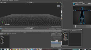

You can also click Layout at the top and there will be saved layout presets which are very useful, the default is named Editing. Motion builder is very customisable and allows you to pretty much change the user interface anyway you want, if you left click hold on the banner of any panel in the software, you will be able to drag it to where ever you want, making your work space more efficient and user Its all down to your own personal preference. friendly.

When you have found a layout that you like the look of go to Layout > Create Custom > OK.

Keyboard configuration couldn't be any easier either, its simple, all you need to do is navigate to Settings > Preferences > Keyboard Configuration and change your key bindings to whatever you like. The great thing is, that you can actually set up the keyboard configuration so it works like Maya's settings.

In the viewer your tools will be located at the top centre area of the main stage. Simply click and drag on either controller to execute desired movement. There are multiple controls for Roll, Tumble, Magnify, Pan, Orbit and Dolly.


Setting Up An Actor and Using Motion Capture

So when a motion capture session takes place and the actor is doing their movements, they usually start out in a T pose so the data trails can be located and recorded by the software. The actor then continues to animate themselves and perform the motion capture sequence. When they have finished a set of movements called ROM (Range of Motion) is captured, these files are used to set up the actual files for motion builder itself.

Using the default Autodesk test files, I will be importing these into Motion builder in .c3d (Coordinate 3D) file format. To demonstrate how the software actually works.

Importing file's really couldn't be any easier just go to File > Import Motion File and when a window pops up, just select the c3D file.

Make sure that you select Import Motion File because its common for people to just drag the file in, or do a generic import and the files can get corrupted and sometimes the software wont read them.
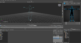


When the file has been imported you will be able to see the blue dots on the screen, these are the different variables that make up the motion capture on the screen. They are called Optical Markers, They form the T Pose

By hitting CTRL + W, you can see the schematic mapping of the optical markers and it will show you the generic hierarchy of the connections themselves.
In total there are about 50 individually named markers and it is the optical markers themselves which group everything together.
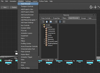

Now it is time to add an actor into the scene, firstly you will need to open up the asset browser if you don't already have it open. By default it is in the bottom right corner but for the sake of practise, Navigate to Windows > Asset Browser.

When this is open, look to the left and Click Browser > Templates > Characters > Actor.

Drag the actor into the main viewer and proceed to the next step.


Once this is done your scene should look like this, you can toggle back out of the schematic window by hitting CTRL + W again.

As you can see there is now a mesh in the center of the viewer, the next thing we will need to do is to match the proportions of the mocap file to the actor as accurately as possible.


The next thing we will be required to do is scale the optical node which in turn will affect all of the data at once which is currently what we are trying to achieve.

Simply Select the optical node at the bottom of the grid and select scale on the right panel.

Try to match the head and the shoulders perfectly as all T poses are executed differently.
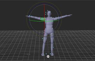


After playing around with the rotations, scale and translations you should have something looking similar to this.

Remember that you can scale the actor, and by selecting the hips, upper leg and shoulders, you can move and scale the major body parts easily.
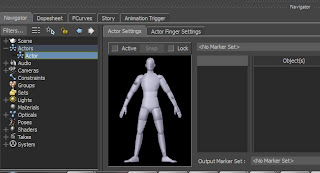
If you scale certain segments , for example the lower leg, this will make the body look out of proportion and we don't want that. So try and scale the major limb segments which will affect the rest for you.

Next open up the navigator window if it isn't already open, and access the actor settings. The easiest way to do this is by Double Clicking Actor > Actor again. This will open up a character penal at the bottom.

 Next click on the market set tool and hit create.
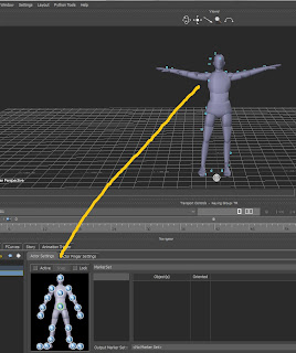

Now it is time to assign the markers to each body part, this is a very meticulous process so make sure everything is accurately done.
Click ALT + Left mouse button or X + Left mouse button if you are using the Maya settings.

A good tip would be to hit wire frame mode on the actor so you can see exactly where you are putting the markers, I was using the Maya settings, so the Short cut was "1" and "3" for shaded mesh.

You can also hide the actor by clicking Window > Actor > Character Controls > Show/Hide Actor (All)

Make sure the head markers are within the head, the shoulder and arms within the major joints so the elbow.
Legs are important to get perfect too, once you have done this, proceed to the next step.
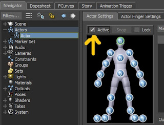
Now that this is done we need to Activate the actor, Un-hide the actors body so you can see the mesh and make sure you save your work and backup! Next go to the Actor settings can click activate on the marker set panel. By enabling this, it will allow the actor to move with the markers, you can go back and make and adjustments if required. Its best to be as thorough as possible though with the positioning a first because you can encounter strange problems and movements if you position them wrong. Motion builder sometimes struggles to calculate the movements correctly.
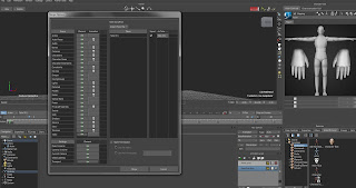

Next we need to add an actual character into motion builder which will replace the actor itself. Using the Character.FBX file that has been provided for me, I will now import it into motion builder.

Go to File > Merge on the menu bar and a window should pop up, locate and load your Character.FBX file and a mesh should appear in the center of the screen.
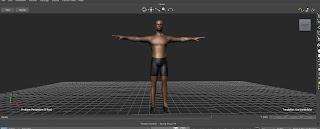
By now you should have a new mesh imported, now before it looks like this, you will have this mesh super imposed on the actor and the mocap markers, so Select the character hit >Display > Hide Unselected. This will get rid of everything in the scene other than your character.
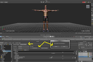
You can also save and import the files into motion builder to test them and make any necessary adjustments. 

If you want to edit a piece of motion capture by adjusting things such as reach and pull in the character control window. You can do this by clicking Navigator < Characters < Character (double click) < Character Settings > Plot Character > Control Rig.
Remember that you must select AnimLayer1 in the layers panel for this to work and for you to be able to start keying.

I hove this have been an interesting tutorial and has shed some enlightenment as to how to start out using basic motion capture settings and processes.
Thursday, 7 March 2013

Week 5 - Idle Pose Extended

So this week I have started to make progress of my extended breathing idle pose. I have really enjoyed making these animations but they proved to be a challenge as I didn't key everything the first time round, so when I played the animation cycle there were a lot of problems arising.

I decided i wanted the breathing to be quite relaxed before everything kicks into an action packed scene.

Below are my initial poses that I have created I will first show the idle breathing then move on to the silhouettes.

Above are the silhouettes of the animation itself, you can see that they are not the strongest poses but they really convey the message of what's going on. You can clearly see the movements, although the riot shield counts almost like an obstruct as its difficult to see the body move in the silhouette's.

The next animation i will move onto will be the kick door animation, where the SWAT character literally kicks the door down, this will be a very interesting process and look forward to honing my skills and producing some excellent animations.

Thursday, 28 February 2013

Week 4 - Crouch Bridge & Presentation Planning

For this week I have been working on the presentation and planing everything that I will be presenting with my group during week six.

For this week I have been finalising the first Idle pose which turned out to be around 40 frames long, I feel like this is an ample amount of frames because the animation will be looping continuously to give the illusion of seamless animation.

Below is my crouch to idle, this shows my SWAT character breathing quite steadily and progresses with him bending his knees into a crouch. This will be the bridge between the next animation and will link to the extended idle pose. This animation isn't much but it will make all the difference and add variation to the movement in the overall scene.


This pose along with the extended idle is the preliminary pose to which the SWAT character kicks down the door which commences the animation. After the detective and the anonymous man will be sprinting to create an adrenaline packed scene.


Below are my Initial Poses which I used for a basic block-out, they are the silhouetted version of the crouch animation.
The animation above has a terrible codec which means the quality of my videos are terrible but please click the links to see the better quality ones.

The silhouetted poses really helped me to create a pose that looked convincing, overall I'm very happy with the result.

Saturday, 23 February 2013

Week 3 - Graph Editor and Dope Sheet

Work Flow

It is a brilliant idea to start developing a personal and efficient working method when it comes to animating, try to use as many different rigs and tools, so you can really tell the difference between certain meshes and different control systems. Personally i love creating controls and building rigs and as you can see above i have put an image of my finished and rigged Zoe model which was supplied to us in my rigging module. 

By rigging a character i have really understood the principles as to how the body works, and should work, it has helped me with anatomy and for that I'm extremely grateful for the knowledge i have gained. 

Seeming as i am going to have to create four animations for the group work, A run idle, breathing idle, extended breathing idle, kick door idle and crouch idle. I will be developing my own particular work flow which i find most beneficial for me. Everyone is different though, some people like to live in the dopesheet and the graph editor, where as i am much more of a visual person, i do everything by eye and feel as opposed to using spline curves and tangents. 

It doesn't mean that you shouldn't understand the principles of the graph editor and dope sheet though, so today i am going to be delving into this subject area, showing you how the graph editor actually works. 

Setting up Maya
Before we do anything, We first need to set up Maya for our animation, the best way to do this is through the time line settings and preferences. As this will be a cut scene/in-game cinematic, we will be rendering out in Real Time at 24 frames per second, as opposed to playing every single frame of an animation which wont look a great deal realistic.  The best way to do this is by clicking the small box on the bottom right, when a window opens, click on the Playback Speed drop down and select Real time (24 fps).

The next thing we want to change, are the tangent settings, in the same window, click the animation tab then click the Tangent drop downs (there should be two) and change them both to spline. This means the control movements will be working on a curved motion basis.                                      So now that everything has been set we are good to go!
The main reasons we change our tangents to spline, is so we can help ourselves work out timing, it also makes poses look stronger.

Tip: The most important tip i can give an animator, is to KEY ALL, by not keying all of your controls, you could cause unnecessary in-between's and it could really ruin an animation, things like the feet sliding or hands moving unintentionally will occur if you don't key all. 
Its so easy to do and saves a lot of cleaning up, and assures you have a nice neat dope sheet, Click channels > Key All in the channel box, and done!.

Dope Sheet

This is an incredible tool and is very useful when you need to change timings of an animation, usually you key everything initially in 10 frame intervals, then when the animation is finished, you can space out the keys and make the timing seem more lifelike and realistic, this is what you use to portray follow through and anticipation, by slowing in and slowing out.

To access the dope sheet couldn't be any easier, simple go to Window > Rendering Editors > Dope Sheet (this is also where the graph editor is located.

On the images to the left you can see that i have included various dope sheet images, all from different animations, the one at the top is an example of a bad dope sheet starting out, there would be a lot of in-between's and there's a lot of negative spacing.

The second image is an example of a very good dope sheet, as you can see everything is keyed and in consecutive linear order, this is the best way to work when you are trying to set up poses. Timing adjustments come later.

The final image is an example of a dance animation I made a while ago and you can see that is has some keys repositioned and gaps, but it works and in-between's are good.

Most animators like to offset their characters motions, for example, if you was walking in a straight line, your body wouldn't be rigid and stiff, it would be loose and your center of gravity would shift left and right distributing weight constantly and differently in each body part. This is also called twinning, its the intentional manipulation of a set of controllers where you make things look asymmetrical. It adds variety and flair to ones work.

Graph Editor

This is a brilliant tool, and most traditional animators are visual but modern day animators tend to use the graph editor a lot because it introduces a form of technicality and complexity to the arrangement of an animation. Its a beautiful piece of kit when it comes to editing key frames and tangent weights.

To open the graph editor you do it exactly the same way as you did with the dope sheet, Click Window > Rendering Editors > Graph Editor.

When the graph editor opens it will look like the image on the left. As you can see all of the tiny lack dots are the different key frames, and the lines connecting between them are the tangents.

As the time slider travels across a tangent, depending on how the tangent is set up, it will affect the animation sequence.

The first image is just a basic key frame on every controller but the controllers haven't been moved so the tangents are all very linear.  The second image shows my kick door animation which as you can see, the tangents are more curved.

As you can see in the image to the left, there are many controllers in the left hand panel, Ill go ahead and select the foot control and it will get rid of most tangents because i have selected a specific one. It will show curves for Translation, Rotation and Scale. The colours correspond to each axis. Yellow being Y, Blue being X and red being Z axis.

Next we are going to be talking about changing tangents. Before i delve into the controls, the first thing i want to show is how to select the actual tangent key.

As you can see in the image, i have selected the middle key for the Rotate Y curve as its the most extreme curve and will serve as the best example.

When you select the key you can see two handles either side, these tangent handles change the curvature of the spline.

As you can see in the left image, I have selected one handle and it is changing both sides of the curve as I rotate it, this is due to it being set to "unity Tangents" but this isn't what I want.

I want to change just one side of the curve, so a way to do this is to "Break Tangents". To do this we need to select the key, then select one of the handles and navigate your way to the top menu bar where you will see lots of different options which will affect the curvature of the spline.


On the left you can see that I have selected one side of the handle and hit break tangents which you can see is highlighted at the top of the image. By clicking this it will allow us to manipulate just one side of the tangent handle, affecting only one side of the curve.


Here you can see that I have broke the tangents (you can see break tangents selected at the top now instead of unify tangents).

This is very useful for offsetting your characters movement paths, and it is a very efficient way of fixing animation cycles and editing your poses.

Below are some more tools that will prove themselves useful. Step Tangents is incredibly useful because it allows you to see your major key poses without any in-between's, it jumps straight to the main key frames so you can make sure you have a strong stage.

When you are finished you can change back to spline curves then work on the in-between's.


Below are some basic ball animations that i have created using the graph editor, I wont be going into extensive detail and they are just for show because this is something I looked into in my first year of uni, if you would like to read more about it here is the link to my original blog. It talks all about squash and stretch, ghosting and much more.

URL: http://oliverstott.blogspot.co.uk/2012/02/basics-of-animation-in-maya.html

So moving on, Here is the first ball animation I made, I apologise for the terrible quality. Blogger doesn't like my own videos sadly.


So in this video you can see that I have created a basic ball animation which shows ghosting,

This effect is very easy to achieve, simple Click Animate > Ghost Selected and it will show you the motion trails behind the main object and you can see exactly what is happening.
Its excellent for spotting in-between's and any faults the animation may have, it allows for easy use of tweaking.

In this next animation you can see that i have created yet another bouncing ball animation, but this implements all of the features of squash and stretch, it is a basic test that everyone should create, just so they get a better understanding of the principles of animation techniques. Squash and stretch is easily achievable through simply scaling an object and key framing the channel box attributes.